Home

Main navigation

  • About
    A group of people in front of a CDA banner.
    • About the Archive
    • Board of Directors
    • Partners and Sponsors
  • Collections
    Collections
    • Designers
    • Firms
    • Clients
    • Dates
    • Project Types
    • Special Collections
  • Programming
    Programming
    • Events
  • Education
    Education
    • Education Toolbox
    • Essays
    • Resources
  • Submit
    Submit
    • Submit Your Work
  • Support
    Support
    • Support the CDA
Home

Main navigation

  • About
    A group of people in front of a CDA banner.
  • Collections
    Collections
  • Programming
    Programming
  • Education
    Education
  • Submit
    Submit
  • Support
    Support

Main navigation

  • About
    A group of people in front of a CDA banner.
    • About the Archive
    • Board of Directors
    • Partners and Sponsors
  • Collections
    Collections
    • Designers
    • Firms
    • Clients
    • Dates
    • Project Types
    • Special Collections
  • Programming
    Programming
    • Events
  • Education
    Education
    • Education Toolbox
    • Essays
    • Resources
  • Submit
    Submit
    • Submit Your Work
  • Support
    Support
    • Support the CDA

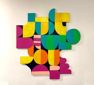
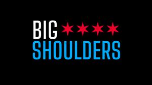
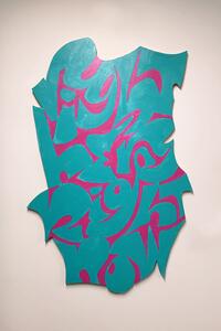
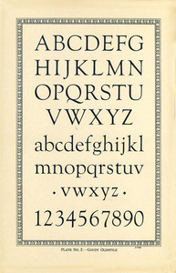
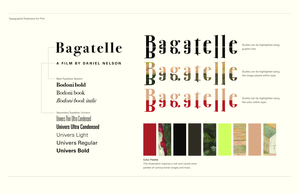
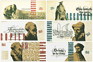
Type Design & Typography

22B-33c_The Schweikher House_Carlos Segura
25B-11d_/v: Magazine — Issue 1 - Open book on a hot pink background. Left page shows a black and white grainy photograph of a skateboarder in mid-air above a crowd. Right page features a large black graphic symbol resembling a dollar sign, with additional abstract symbols inside_Sean Fermoyle
23B-12a_The Affordances of Scripting Typography_Pedro Neves
20B-53.tif
21B-05A_Poetry Foundation: Poetry Magazine Cover_Nick Adam
22B-34b_STA100 Show Branding_Carlos Segura
23B-05a_Regional Transportation Authority Rebranding_John Pobojewski/Valeria Bernal
20B-13.tif
22B-04b_What Does Chicago mean to you? poster_ Sean Fermoyle
18I-24_C is for Container Corp of America_Carlos Segura
25B-09_OPUS/ Design Exhibition Poster_Sajad Amini/Magda Wilhelm/Izzy Lima/Skylar Baker
22B-09c_Wingspan Type_Raven Mo
22B-32b_Lo+June Branding_Carlos Segura
18I-19_G is for Morton & Mille Goldscholl_Rick Valicenti
21B-03C_University of Illinois School of Art + Design 2020 MFA Program Identity_JP Ramirez/Andrew Reaume
22B-13a_The Silver Room Campaign_Nick Adam
20B-11.tif
25B-06_Chicago Is... Poster_Michaile Brooks
18I-17_E is for Edelman Design_Whitney Colley
25B-11c_/v: Magazine — Issue 1 - Open magazine with abstract black shapes on a white page, set against a bright pink background_Sean Fermoyle
22B-15b_Taste of Chicago Branding_Nick Adam
18I-22_U is for Unimark International_Renata Graw
18I-02_& is for Barnhart Brothers & Spindler_Jackson Cavanaugh
22B-38b_Classic Color Branding_Carlos Segura
22B-37d_T26 SAN Promotion_Carlos Segura
23B-14c_ReFramed: The Future of Cities in Wood Exhibition Design_	Bud Rodecker/Alyssa Arnesen/Marisa Cruz
20B-21_150 Media Stream Brand Identity_Daniel McManus/Sofya Karash
22B-34d_STA100 Show Branding_Carlos Segura
20B-12.tif
18I-09_Y is for You Are Beautiful_Matthew Hoffman
18I-14_F is for Frederic & Bertha Goudy_Kira Crugnale
18I-07_Q is for Quite Strong_Shannon Downey
18I-26_! is for Protest_Ben Blount
22B-23c_WaxTrax “Blackbox” project_Carlos Segura
22B-06a_Word Play_Judith Mayer
18I-13_R is for Robert Vogele_Dana Arnett
22B-17d_Copi: Rebranding an Invasive Fish as a Healthy Seafood Option_Nick Adam/Bud Rodecker/Avery Branen/Valeria Bernal/Leah Wendzinski/Suzie Shin/Darcy Nathanson
20A-23_Standard Studios Locations Business Promotion_Gustav Rehberger
25B-10_Bilingual Typography at CAA 113th Conference: Poster_Sajad Amini
123
20A-15_Pentothal by Abbott Labs Magazine Ad_Gustav Rehberger
22B-32a_Lo+June Branding_Carlos Segura
20B-10.tif
22B-29c_Alex Ross Stationery_Carlos Segura
21B-05A_Poetry Foundation: Poetry Magazine Cover_Nick Adam
22B-37a_T26 SAN Promotion_Carlos Segura
22B-08_Women Owned Brand image_Jack Muldowney/Kasia Patel
22B-35a_T26 Itty Bitty Promotion_Carlos Segura
21B-03A_University of Illinois School of Art + Design 2020 MFA Program Identity_JP Ramirez/Andrew Reaume
20B-25_Bagatelle Movie Poster_Daniel McManus/Sofya Karash/Igor Karash
18I-04_# is for Trends_Nick Adam
24B-45b_EGG! Identity_Sean Fermoyle
22B-34c_STA100 Show Branding_Carlos Segura
22B-01.tif
23B-02c_Let Parents Stay (Han Embroidery Typeface)_Yu Chen
18I-25_M is for John Massey_David Csicsko
24B-42d_PT Supplement_Sean Fermoyle
22B-09b-Wingspan Type detail_Raven Mo
23B-16a_You Create Tomorrow posters_David Sieren
18I-11_D is for Ray DaBoll_Alicia Marques
22B-15_Taste of Chicago Branding_Nick Adam
18I-23_T is for Herb Temple_Liz Kanter
22B-35b_T26 Itty Bitty Promotion_Carlos Segura
23A-06b_Word Paintings_Judith Mayer
24B-42c_PT Supplement_Sean Fermoyle
18I-27_O is for Oswald Cooper_Maria Grillo
20A-25_NY Table Tennis Courts Souvenir Program Back Cover_Gustav Rehberger
18I-05_B is for Bobbye Cochran_ Tanner Woodford
18I-01_L is for László Moholy-Nagy_Eileen Tjan
25B-08_Non-resident Aliens/ Resident Non-aliens Poster_Sajad Amini
22B-38a_Classic Color Branding_Carlos Segura
22B-02.tif
20B-24_Bagatelle Movie Poster_Daniel McManus/Sofya Karash/Igor Karash
23B-14a_ReFramed: The Future of Cities in Wood Exhibition Design_	Bud Rodecker/Alyssa Arnesen/Marisa Cruz
22B-16b_Slow & Low at Navy Pier_Nick Adam/Avery Branen
23B-12c_The Affordances of Scripting Typography_Pedro Neves
23B-02b_Let Parents Stay (Han Embroidery Typeface)_Yu Chen
22B-35c_T26 Itty Bitty Promotion_Carlos Segura

Pagination

  • First page First
  • Previous page Previous
  • Page 1
  • Current page 2
  • Page 3
  • Next page Next
  • Last page Last

Footer menu

  • Contact
  • Policies
  • Rights

© 2002–2025 Chicago Design Archive. All rights reserved.