24B-45b
EGG! Identity
Designer
Client
Date
2024
Project Type
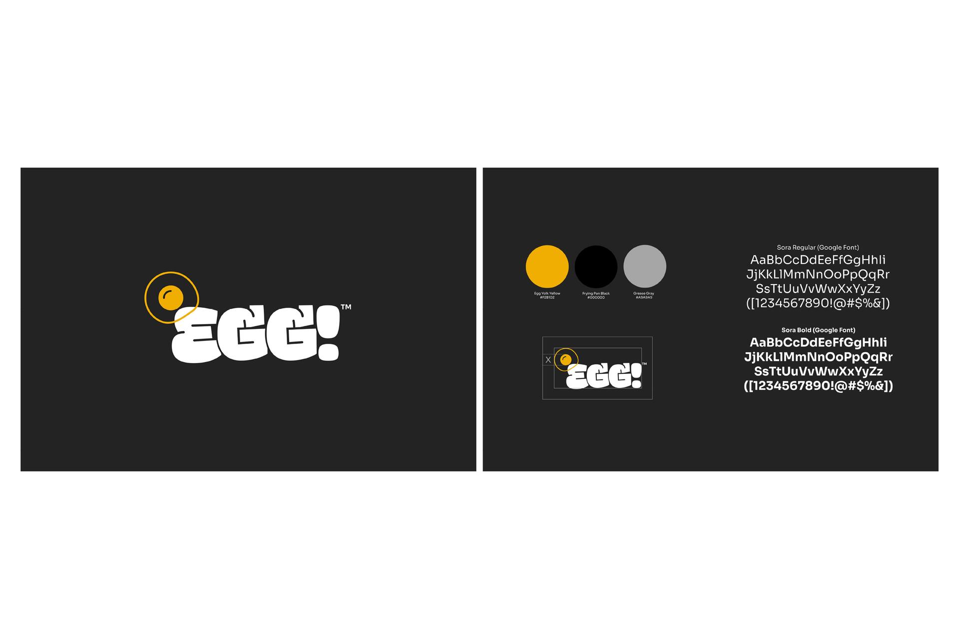
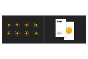
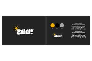
Two veteran photographers/filmmakers created EGG!, a studio with offices in Chicago and Vancouver, WA. They've shot campaigns for various clients, big and small. I helped them choose the name, inspired by the "chicken or the egg" dilemma, and designed their brand identity from scratch. This included a versatile icon family, business collateral, and a website, all reflecting their unique perspective, attitude, and humor. They believe declaring a viewpoint on this topic sparks dialogue and conversation, the essence of great storytelling.