Poetry Magazine Cover
For centuries, poetry has inspired experiments in typography. The manner in which a poem is visually composed effects how the poem is read — the underlying structure of words and letters themself inflects intent, emphasis, and meaning. The structure of letters themself are a product of form-poetry, they carry their own unique set of spacial relationships and visual codes.
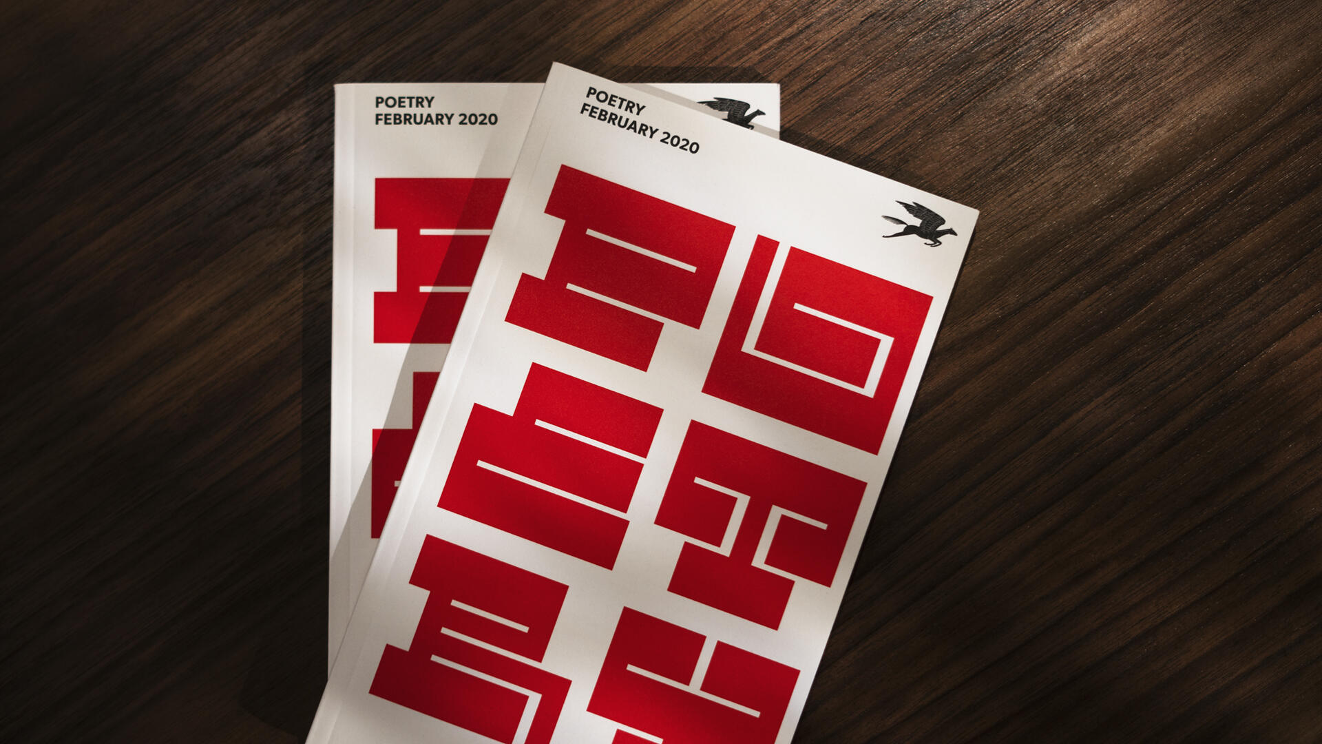
Founded in Chicago by Harriet Monroe in 1912, Poetry is the oldest magazine devoted to verse in the English language. In 2019, Poetry's Art Director Fred Sasaki reached out to Nick Adam to design a custom typographic cover, in February of 2020, the cover was released.
Nick designed a series of 3 covers for POETRY to consider publishing. The letterforms of the selected one (published in February 2020) were built within POETRY's grid defined by Michael Bierut. Nick took POETRY's distinctive two-by-three unit grid and divided each of the 6-units into square units. Nick's new grid within Bierut's existing system was used to define each letterform by following a simple set of mathematics:
Vertical strokes = 4 units
Vertical counter space = 2 units
Horizontal strokes = 9 units
Horizontal counter space = 1 unit
The designed letterforms can be described as rhythmic, reverse-stress, extended, blocky-slab-serifs.