Taste of Chicago Branding
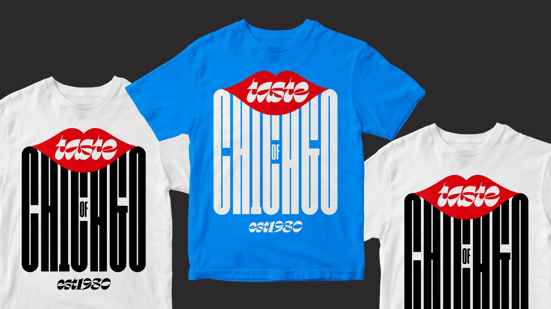
2020 marks the Taste's 40th anniversary, starting in 1980 with Mayor Jane Byrne. This year the Taste of Chicago festival has been reimagined (due to COVID-19) to showcase the diversity of Chicago’s culinary scene while supporting local nonprofits and frontline workers with free meals. This year the City of Chicago partnered with the Design Museum of Chicago to commission Nick Adam of Span to design materials that would raise money for the Arts for Illinois Relief Fund.
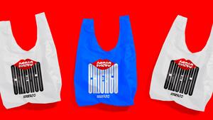
The design focuses on lips as through them it’s how we eat, how we sing ... it’s how we say I love you. Our lips were inspired by the legendary Magikist signs designed by Doris Greenwood that once lined the expressways. As Chicago is globally known for its style-writing (from lettering to graffiti) our Taste logotype utilizes and modifies a highly-stylized flat brush typeface from Ohno. Swear was released earlier this year through Future Fonts. The custom block lettering is inspired by Chicago style architecture and by Jackson Cavanaugh’s AGI poster.
Our identity expresses Chicago-ness while positioning the city as the United States’ culinary capital.


