Hot Chi
Hot Chi is a Chicago-style, Nashville-inspired, hot chicken in Chicago’s Chatham neighborhood. Life-long South-siders Amer, Mutaz, and Kinan have long had a passion to feed communities. When Chatham lost what was widely considered the best fried chicken franchise in Chicago, the brothers decided to step up
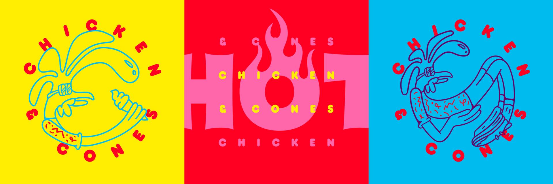
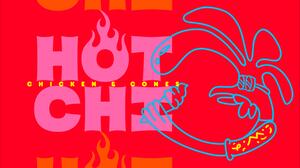
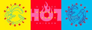
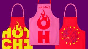
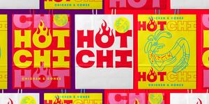
Span created the name Hot Chi, a play on their specialty, hot chicken, while at the same time embracing Chicago’s nick-name Chi-Town. Hot Chi is simple, memorable, and screams Chicago-style hot chicken.
Made up of two 3-letter words, the name itself is a graphic strategy making the two terms perfectly stackable. This enabled Nick Adam’s custom lettering to be drawn with equal widths, so the ‘O’ can center and get lit up. Our visual approach transformed the typographic to iconographic. We created a mascot to emphasize a fun and approachable personality. The mascot is often seen eating an ice cream cone, a direct rendering of the restaurant’s offerings — Chicken and Cones.