Archive 10: The Society of Typographic Arts
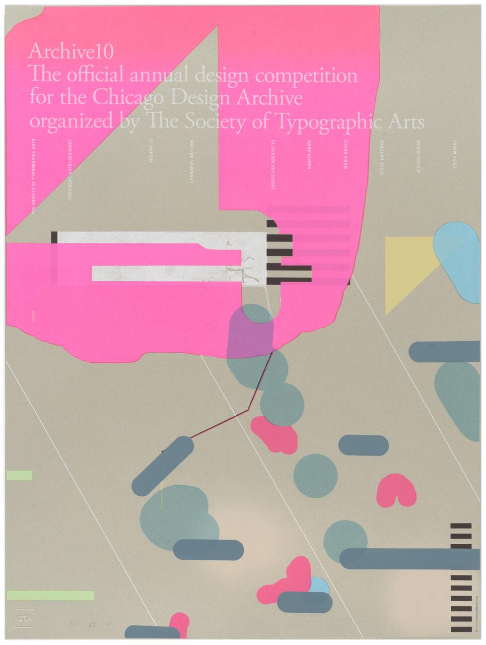
This image, with its organic forms, asymmetrical composition, dynamic negative space, and color takes inspiration from the Japanese aesthetic tradition called wabi-sabi. Wabi-sabi is a school of thought. It’s similar to the ancient Greek idea of beauty, but with a twist. It embodies the idea of beauty through looking backwards, forward, and understanding the present with a transcendental component. Its roots are in things “imperfect, impermanent, and incomplete”.1 For example, a handmade ceramic vase that shows the wear of use and age. With that in mind, we started this project by picking a paper that sits a bit outside our comfort zone. The sage green paper, Mohawk Loop Smooth, seemed more suitable for a church program or obituary. The texture and color of the paper seemed dusty and stale, out of step with a contemporary design competition and archive. Yet, it was this mismatch or “imperfection” that ultimately drove our design. Our choices of color and form were a direct reaction to it. These types of exercises can open new territories by challenging notions of good or bad, requiring a coming-to-terms with an object’s essence to truly create a solution. This was as much an existential exercise as it was an aesthetic one.
1. Koren, Leonard. Wabi-Sabi: for Artists, Designers, Poets & Philosophers. Point Reyes: Imperfect Publishing, 2008. Print.
Much of our work at the studio is centered around the idea and practice of image generation. The majority of our designs rely on images for impact, so finding the right vehicle to produce images collaboratively is crucial to the success of every project. Methods can include choosing specific mark-making materials or photo processes, but sometimes we need a method outside of the realm of art all together. This poster, in particular, had a surprising starting point for the image. While visiting friends in Champaign, Illinois, we had the opportunity to attend a college football game. From the bleachers, it dawned on us that this game was a perfectly coordinated aesthetic performance defined by change and mapped by a system. While it had many organic elements, it was ultimately defined by strict parameters. The composition for this poster was inspired by that observation. The shapes found on the poster are based on a video still from a football game. The poster composition as a whole relies on this playful yet systematic arrangement of shapes for its forward-moving energy. Color relationships within the cluster of shapes create further rhythm and movement. The large pink form activates and counters their movement with its amorphous form and bright color. The type treatment eschews hierarchy, listing the primary information in sentence form. The headline, “Archive 10,” gets a visual boost from the large triangle shape behind, which mimics the “A” in “Archive.”


