
The Chicago Design System
January 20, 2023Community Use Is Enshrinement
The Chicago Design System
This essay is to clarify the purpose and intent of the Chicago Design System and the Public Mark, and to explain what they are and how they came into being.
The Chicago Design System began as an effort to document visual and experiential standards and legal obligations for accessibility, readability, and language access standards. It grew into a design system through the work of many people in government, local universities, and communities in Chicago and across the world.
The Design System is composed of the Public Mark, Big Shoulders (a new civic typeface including the symbols of the Public Mark), a color palette, and new standards for inclusive physical and digital communication. It is a once in a century update to the City’s identity, but COVID marred its rollout. Why does that matter? What can city symbols mean?
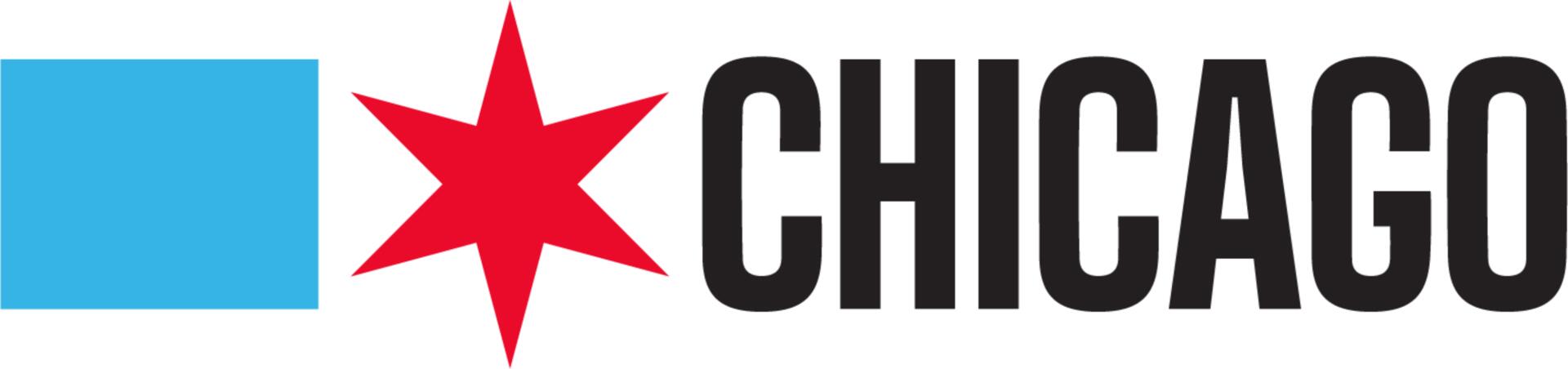
The Horizontal Public Mark
The Public Mark is the first update in 103 years to how Chicago government appears, and serves residents and visitors—a completely new design architecture built upon our best visual foundations—but it is also a new way for the people of the city to view themselves and their story within it.
As the first open source design system built for community and municipal use, the Chicago Design System represents an innovation in how people connect with each other and represent themselves and their communities within Chicago. It is estimated to save the City several million dollars each year in design production costs, but more importantly it offers people the ability to see themselves in the City’s symbols and share their love of their City with pride and ease.
When you want to get a tattoo of a Chicago star, getting it right shouldn’t be difficult. When you look at the symbols of your city you should not feel excluded—but that hasn’t always been the case.
Municipal symbols are a design oddity.
It is their job to stay static in an ever-changing world. They remind us of the distance we’ve traveled through time and simultaneously point to better days ahead as we march on our narrative of progress.
As the first Design Director for the City of Chicago, I felt this legacy in my work every day. I liked to say I had a couple centuries of design debt to address, but Mayor Rahm Emanuel and Commissioner Danielle DuMerer quickly focused my work on three things: make the new 311 system work for residents (“Like Amazon!”), make our website “suck less,” and make our brand look better.
Some of the challenges were innovation on the mundane aspects of government life. Can we work with residents to create not just a new platform, but a new way of working with people to create truly valuable municipal digital services?
Some of the challenges were unique to the City’s history. We modernized over two hundred municipal services, and discovered the City offered several thousand more, unknown or undocumented except to a guy who knows the guy who can call the guy who can get you the thing.
Some problems are more difficult than others, like how to visually represent a city as diverse as Chicago. The City didn’t have a uniform identity. It had well over a thousand logos for itself via decades of departments empowered to pay designers to procure logos for programs as they saw fit. This fractured approach caused confusion with the public and a chaotic presence in the world. We found vast disparities in service depending on where you live and who you are in the City, and places where the City’s seal is less recognized or trusted than nonprofits to be helpful to people in need.
Early (mis)steps
As we worked to support the 311 team and all Chicago through its digital transformation we cast about desperately for brand standards, but it was worse than having none. We had many. Often a program, project, or platform came with a system. There were a few hundred laying around. Partially implemented, poorly documented, barely designed.
Print was far more complex in how it was budgeted, sourced, and produced. It seemed there were thousands of guys who knew a guy. Conveniently, most of these guys ignored municipal code—law—demanding accessible and understandable communications translated into six or seven different languages. Without City gatekeepers, why police yourself?
With so many unmanaged logos, processes, and systems we had the daunting task of starting from scratch while the project was underway. By haunting the Harold Washington Library’s Municipal Reference Collection and newspaper archives we were able to build a history of Chicago’s symbols to use as a basis for the new 311 logo.
Our first attempt to deliver a branding system for 311 informed the Chicago Design System through successes and misfires. It was difficult to coordinate, execute, set strategy, or obtain approvals. Cities do not have permanent marketing or brand managers. They often rely on outsiders to perform that role, but outsiders can’t give City approvals. Employees can. It was a vicious cycle we broke by eventually building a relationship with the Communications team in the Mayor’s Office.
The original CHI311 brand is an amalgam of typography traits inherited from President Obama’s 2008 and 2012 campaigns, the first term of Mayor Rahm Emanuel (who’d served on President Obama’s staff), and a proposal for city departmental badges from the early 1920s featuring a Chicago star of two colors in a circle for the Department of Public Service. Using a palette of colors from the latest version of the seal, we chose red and blue for our sunrise star to symbolize the sun rising over the lake.
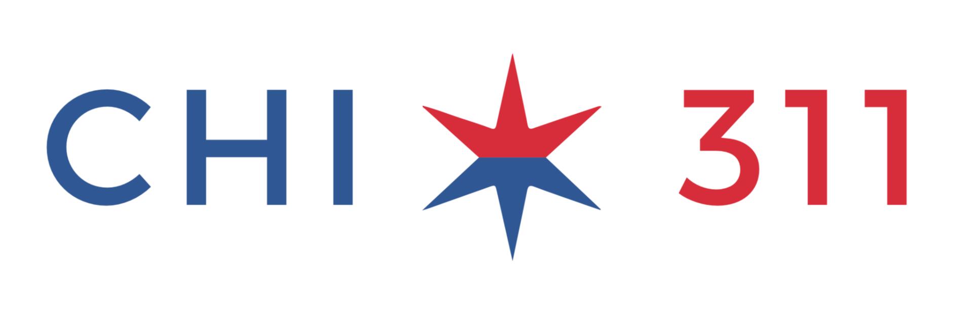
The CHI311 logo
Our color palette was derived from the digitization of the 1975 version of the seal. Beyond red and blue it induced nausea, unless you were big on playing Twister. We simplified the brand and delivered a workmanlike effort at launch two years later. The 311 project was nearly the first to use the Public Mark, but its approval by Mayor Emanuel did not occur until the day after 311 launched, at the end of 2018.
The 1975 seal, with its bright colors
All the 311 community dialog and graphic design research had built the case for creating a design system to provide consistent, modern, pleasing answers to the same questions about color, logo, type, layout, format, and experience. The Mayor’s Office connected us to pitch several firms who had been pro bono partners of the City in the past to do the work on that basis now.
I generally frown upon pro bono work. Designers should be compensated for their time. The job done for nothing often has a similar impact. But in this case, we made the fact we had no money work for us. People came to work on the design system through love of Chicago, not for money. This became a strength, as it allowed us to overcome many internal barriers to traditional efforts to create change. Grounding our work in open source, social justice, and history made it hard to argue against, but also challenging to do.
Of those we were introduced to, only the advertising agency Ogilvy was brave or crazy enough to pursue the work with us. That isn’t to say others wouldn’t have, couldn’t have or shouldn’t have. Believe me, I agree. Being able to work pro bono is, in itself, a privilege. We pitched hard and begged for help. When someone said, “yes” they were welcomed aboard. It was an imperfect process, but everyone was working for free. We were all more forgiving of missteps and committed to finishing.
We had Mayor Emanuel’s approval, but no one wanted to make a big change before an incoming administration, so we were in limbo. Over the next year and a half Ogilvy would fade in and out as the project ebbed and flowed and Mayoral administrations changed, but they were a fount of ideas and stellar work, always there at critical junctures with sage advice and support.
They brought in type designer Patric King, whose grit and determination gave us precious progress to show as many sought to ignore or kill the work during the transition. I still don’t think anyone paid Patric. Additionally, we recruited teams at Northwestern University and DePaul University to design, extend, and build parts of the system.
And when I say “we” I mean me and the interns. Tait Chamberlain, Lukas Hoffman, Derek Hunter Ramos, Gregory Kim, and Abigail Lammers were instrumental in their research, design, coding, interviewing, writing and other contributions.1
But why build a new identity in the first place? Don’t we have a perfectly good enough identity at home?
All the 311 community dialog and graphic design research had built the case for creating a design system to provide consistent, modern, pleasing answers to the same questions about color, logo, type, layout, format, and experience. The Mayor’s Office connected us to pitch several firms who had been pro bono partners of the City in the past to do the work on that basis now.
I generally frown upon pro bono work. Designers should be compensated for their time. The job done for nothing often has a similar impact. But in this case, we made the fact we had no money work for us. People came to work on the design system through love of Chicago, not for money. This became a strength, as it allowed us to overcome many internal barriers to traditional efforts to create change. Grounding our work in open source, social justice, and history made it hard to argue against, but also challenging to do.
Of those we were introduced to, only the advertising agency Ogilvy was brave or crazy enough to pursue the work with us. That isn’t to say others wouldn’t have, couldn’t have or shouldn’t have. Believe me, I agree. Being able to work pro bono is, in itself, a privilege. We pitched hard and begged for help. When someone said, “yes” they were welcomed aboard. It was an imperfect process, but everyone was working for free. We were all more forgiving of missteps and committed to finishing.
We had Mayor Emanuel’s approval, but no one wanted to make a big change before an incoming administration, so we were in limbo. Over the next year and a half Ogilvy would fade in and out as the project ebbed and flowed and Mayoral administrations changed, but they were a fount of ideas and stellar work, always there at critical junctures with sage advice and support.
They brought in type designer Patric King, whose grit and determination gave us precious progress to show as many sought to ignore or kill the work during the transition. I still don’t think anyone paid Patric. Additionally, we recruited teams at Northwestern University and DePaul University to design, extend, and build parts of the system.
The Seal
At their creation, civic symbols represent the hopes and best intentions of the people who make the city. But which people? What hopes? What stood here before the city replaced it? The answers to these questions can be unsettling, as they represent a history of accomplishments built upon a foundation of white supremacy. It is a history of one group’s conquest and the tragedy of others, with plenty of heroes, victims, and villains to go around.
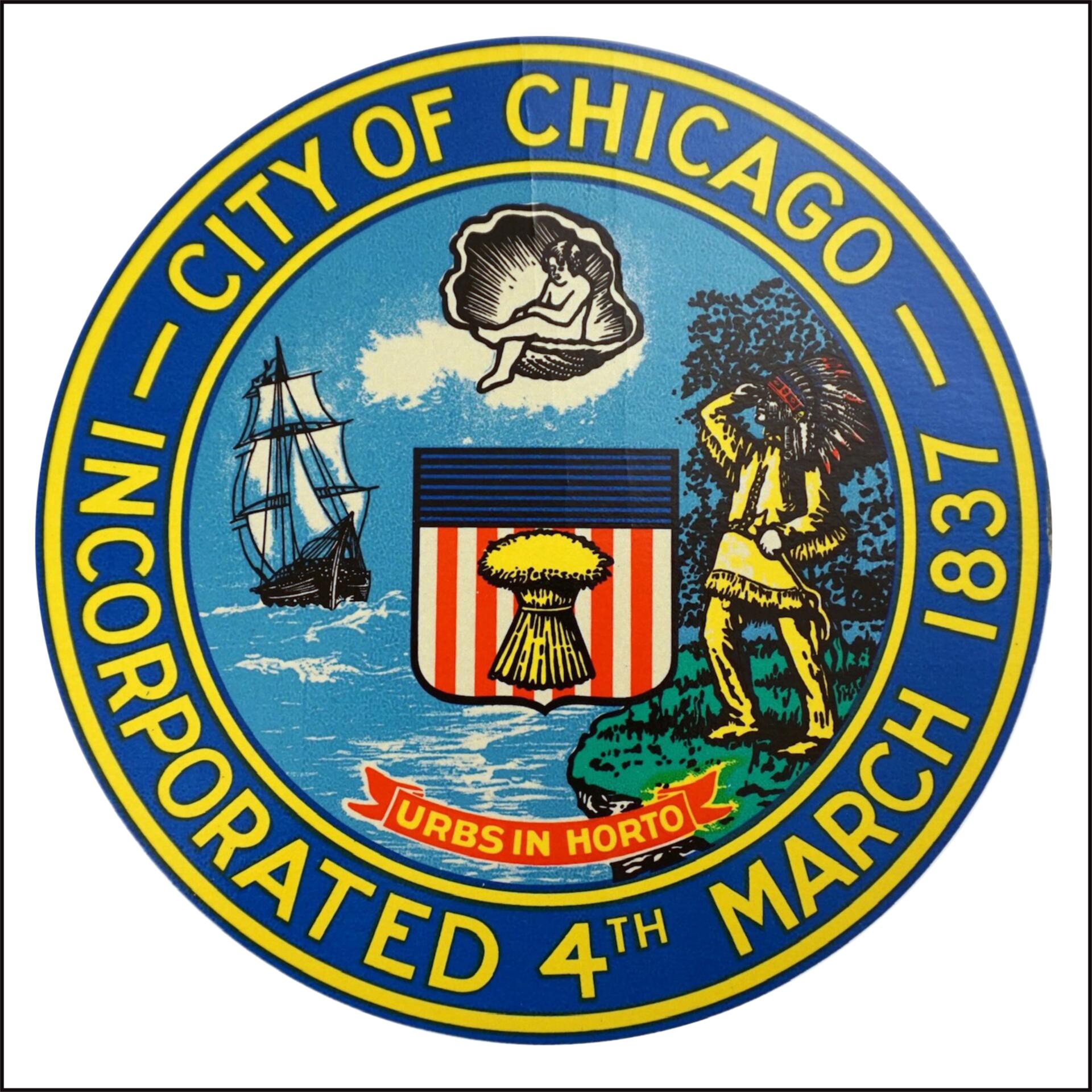
The original municipal symbol of Chicago is the city seal. Seals are the common means in many jurisdictions to indicate a document or communication is official. What’s represented in each seal is different, though. Illinois, a former Indian Territory, became a state in 1818. Colonel Thomas Owen, as the first President of the board of trustees of the town of Chicago, modeled our seal on the reverse side of a United States half eagle gold coin in 1831.2
Our seal showed a First American on the left, or west side; the aforementioned purloined American shield in the center; and a ship arriving from the east, or right. Its depiction is lost to time, but we know it had these features as they were adopted, revised, and encoded into law when Chicago became a city in 1837. William Ogden’s commission, creators of the city seal, declared that it represented “the approach of white man’s civilization and commerce.”3 It is a record of the plan to use the shield of nationality to bulldoze indigenous people, make a town, and get rich through belief in Manifest Destiny.
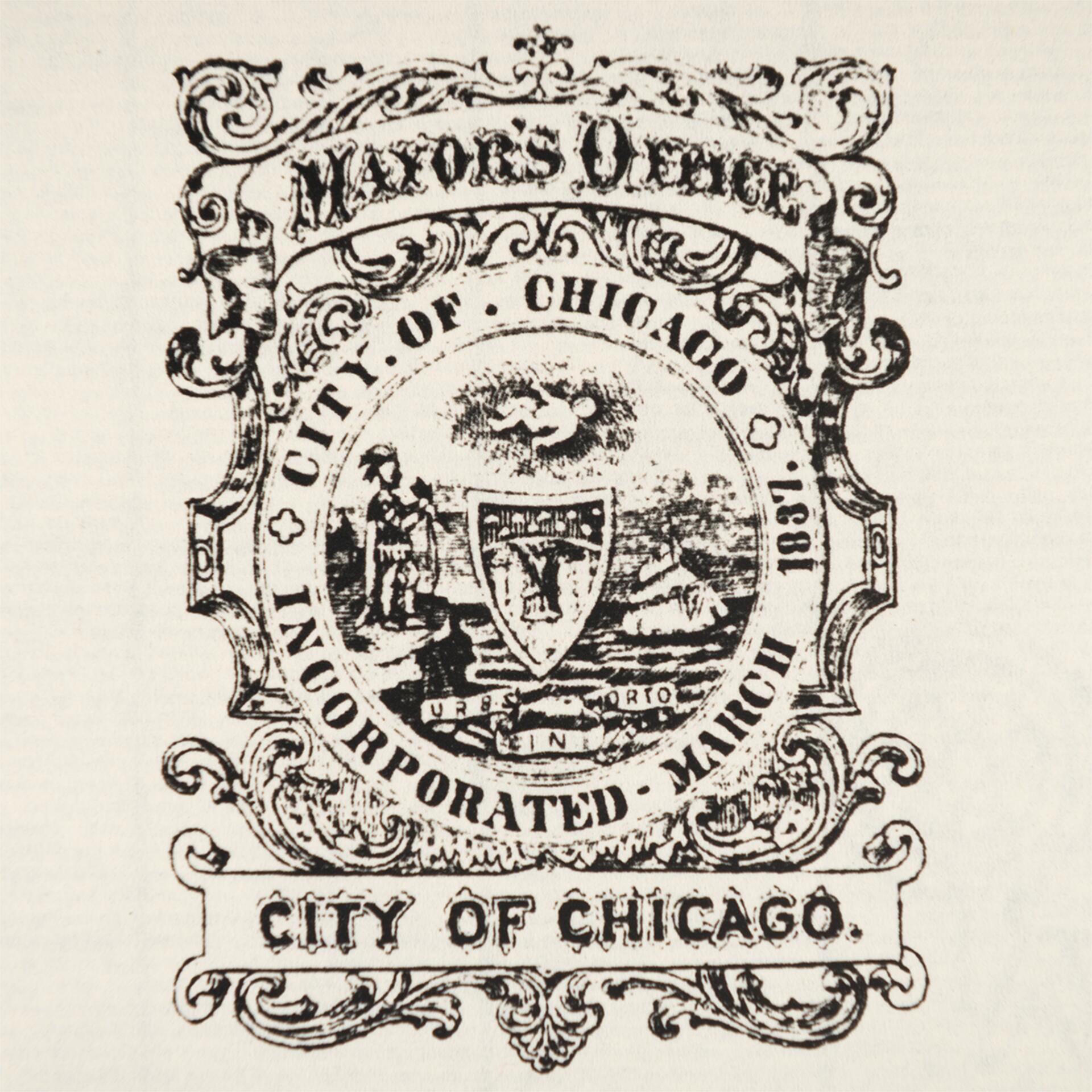
This copy of an 1880 version of the seal is one of the oldest surviving examples in Harold Washington Municipal Reference Library archive
It’s easy to punch down and judge the actions and worldviews of people in the past through the lens of today. There is blood in the mortar of any great work created by people, from the pyramids to the Great Wall to the United States Capitol Building, and little of it is shed willingly or justly. It is not my intent to absolve the past or minimize our ancestors’ accomplishments or failures, but to acknowledge that the identity displayedwithin the seal is one Chicago quickly shed even as the debate and dialog about equity and social justice continues today.
Nobody but the government adopted the seal. It’s meant for official business, not community spirit. Further, its origins are obscured because of the Great Fire of 1871. Ordinance amendments in 1854 added the baby, and in 1893 indicated it should be on its back in a shell.4 People still debate what that particular part of the seal means, but it is a case of subtraction by addition. Somehow, it means less than it did before. In 1905, the City hired Dr. Bernard Cigrand to re-render the seal. City Council then re-declared the elements of the seal and their meanings, flipping the ship and the figure to opposite sides, potentially to obscure the original intent of the design.
In 1987, Mayor Harold Washington condemned the seal’s inherent racism and the City Council debated changing it to represent Jean Baptiste Point du Sable, our first known resident who was, not incidentally, a person of color. Throughout the 80s Mayor Washington locked horns with Alderman Ed Burke, who considered himself the keeper of all things related to the City Seal. Burke suggested changing it to Father Marquette, who’d visited Chicago about the time DuSable was settling there. The unhappy compromise to stop the legislative impasse was editing the description of the seal, but not the seal itself.
Symbols of Progress
As Chicago rose to global prominence in the 20th century, we made symbols to represent our pride in engineering and our resilience in the face of adversity.
In 1892 the Chicago Tribune announced a contest for municipal colors to decorate the city for 1893’s World’s Fair. In a little less than two weeks 819 entries were submitted, many of them went beyond colors to include flags and banners, like entry #17: “17. Red shield or banner divided into three parts–representing South, West and North sides-by a band of white or silver, representing the river.” This entry5, by Mr. Alfred J. Roewad, won the contest “because of the symbol and the flag and banner designs, as well as the ubiquity.”6
By 1900 it came to symbolize in people’s imaginations our reversal of the Chicago river, often referred to as “the engineering feat of the century,” but its use in banners and flags had subsided after the World’s Fair.
In 1915 we commissioned our flag, commemorating with its two stars the tragedy of The Great Fire of 1871 and our rise from the ashes 22 years later to host the World’s Fair. We enshrined both the municipal device and the city flag in the municipal code in 1917, making them “official.”
As the City grew in population with immigrants from around the world, we adopted these new symbols to represent us. The municipal device remains an architectural device and appears in buildings, fences, gates, bridges and other civic infrastructure around Chicago, but its simplicity and “ubiquity” was its undoing. It looks like a peace sign, a luxury car hood ornament, and a thousand other things as well.
Per the municipal code, every City vehicle and police car should display it, but to my knowledge there is no photographic evidence of the police with the municipal device upon their cars. There’s an urban legend that the 1968 Democratic National Convention riots stopped police interest in the municipal device given its resemblance to an inverted peace symbol. It doesn’t seem true.
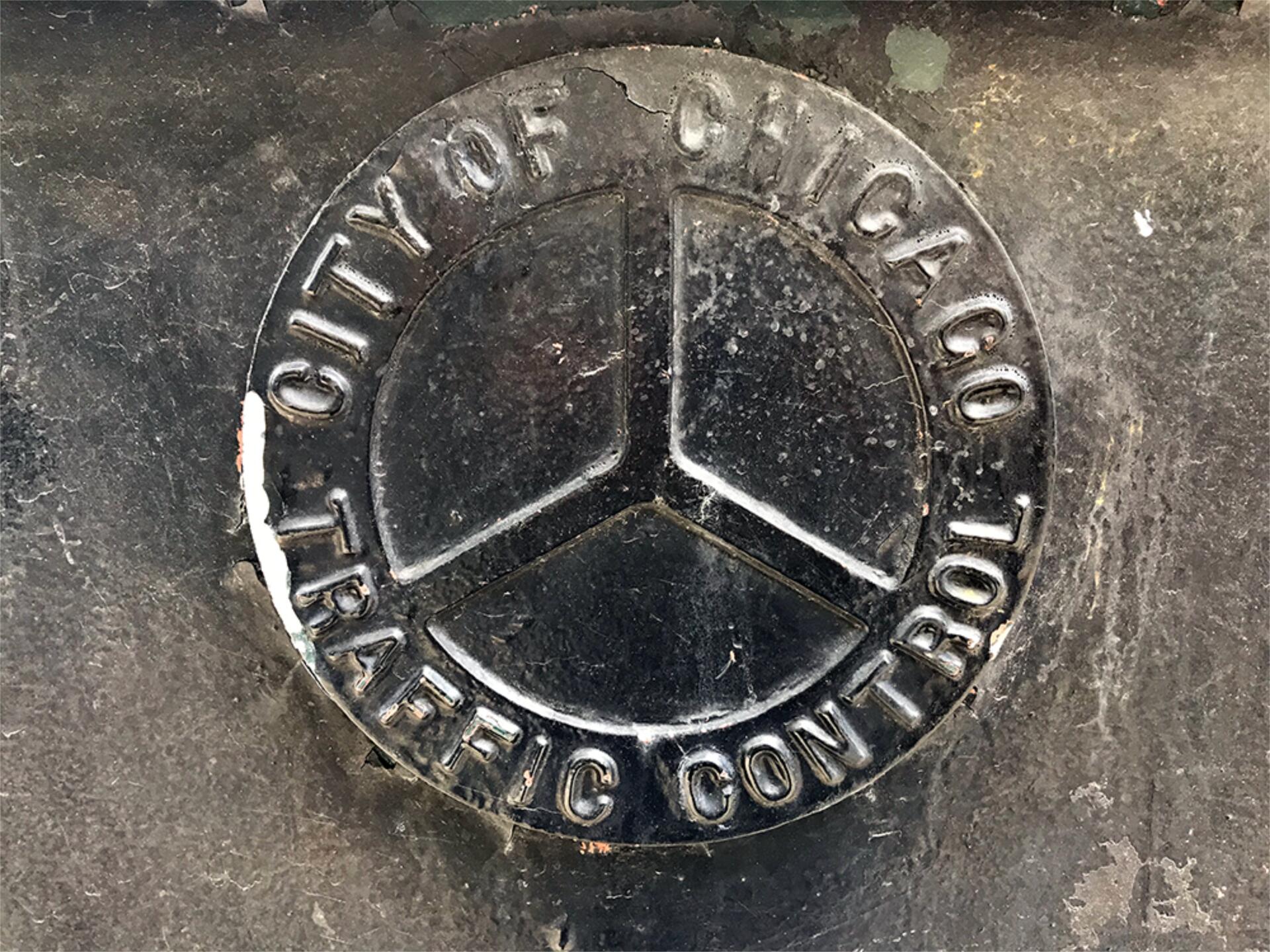
A Traffic Control box in downtown Chicago displaying the upside down Municipal Device.
Ask a dozen Chicagoans about the municipal device and they’ll give you a puzzled look. They have no clue what you mean. The municipal device is the graphic design secret handshake of Chicago. Now you’re in the club!
Ask them the contents of our seal, you’ll get more puzzled looks. But ask your 12 new friends to draw the flag and those able to put pen to paper will get it right every time. Chicagoans know good design.
Wallace Rice’s masterpiece of vexillology overwhelmingly represents Chicago in the hearts and minds of its residents as well as the world.
His careful construction of the star and the static composition of the design of the flag is laden with intent and rich with symbolic meaning. Most importantly, they are recognizable, yet unique. Where the municipal device lends itself to understatement and blending in, the stars stand out.
Rice and others assigned meaning to each element of the flag. Others have written about this so I will leave it alone except to comment on one specific element: Four stars, people. No more stars on the flag. Every Mayor since the fourth star went on in 1939 has been asked for a fifth star on the flag. No fifth star on the flag.
Rice clearly intended four stars as a maximum because he gave us the first two in perfect symmetry for two more. An additional star destroys the proportions and relationship of the blue bands and the white field.
Good design rarely trumps politics, so we had to make sure our solution addressed that community need.
Launch
We launched the system March 4th, 2020, Chicago’s 183rd birthday. Later that day my team created the first City of Chicago COVID site. By the end of the year it would receive more traffic (tens of millions of visits) than all other City of Chicago websites combined. Our north star was to ask if a person with an 8th grade reading level who doesn’t speak English could access our content on a pay-per-use mobile phone and make life-changing decisions based on what they understood. More often than not the answer was “no.”
That work became the basis for new standards in signage, data visualization, logo lockups and the other elements that make up a living design system, but many of those contributions didn’t make it back into the system. COVID stopped the rollout of the system as we closed government down to only provide essential services. It halted the creation of processes to incorporate feedback, share best practices, and mature the system. The feedback and tension of old and new which Bringhurst wrote about so eloquently.
As vendors, volunteers, and organizations from near and far flooded the zone to help out we were able to share the system, which was a great help, but not to reincorporate their new ideas or reinforce standards. Nobody had time to nurture the system in a crisis and it suffers today for the lack of a design team dedicated to its evolution, usage, and maintenance.
The Public Mark
Unlike other municipal symbols, the Public Mark is the first mark intended for government AND public use. It is called the Public Mark because it is a mark, not a logo. Marks are typographic accents to indicate meaning. The Public Mark is an indicator to show your community belongs in Chicago. Big Shoulders, our typeface, is a toolkit for you to use to display your love for your community and your pride of place, all at the same time.7
That fifth star? It’s the new Public Mark. The fifth star is for you.
You may be thinking, “What would I ever do with a fifth star?” Well, I don’t know, either. They’re your hopes, your dreams, your community. Roll up your sleeves, shake out your shoulders, and get to work showing you care.
You’ll find the answer soon enough.
–Jason Kunesh, Chicago, January 20, 2023
1 And with the help of many others.
See: https://design.chicago.gov/credits/
2 The reverse side with the eagle, and the older design with the banner, which was on both half and quarter dollar coins through 1834. I wonder if the Urbs in Horto banner was at the top prior to the baby’s addition in 1854.
See: https://americanhistory.si.edu/collections/search/object/nmah_1077330 and
https://americanhistory.si.edu/collections/search/object/nmah_1077042
3 Sun Times, September 4, 1987 “Emblem’s baby has been restless over the years” William B. Ogden Commission Report quote.
4 See https://www.chipublib.org/chicago-facts/
5 See the sketches of this entry here https://en.wikipedia.org/wiki/Municipal_device_of_Chicago#/media/File:Sketches_tribuneoct11892.jpg
6 “Council on Colors It takes up the Plan for Decorating the City” September 13, 1892
https://chicagotribune.newspapers.com/image/349491435/?terms=chicago%20colors&match=1
“CHICAGO’S MUNICIPAL COLORS Design Selected as the Result of ‘the Tribune’s Prize Contest” April 27, 1893
https://chicagotribune.newspapers.com/image/349860922/terms=municipal%20device%20contest&match=1