
The Container Corporation of America and Graphic Design in Chicago
March 6, 2018In the early 2010s, a selection of posters from the mid-1960s for the Chicago Cultural Communication Project were reprinted, sold online, and exhibited in several museums throughout the city.1 The reprints offered a reminder of what graphic design in Chicago had been. Now difficult to characterize, Chicago graphic design once had a reputation in the mid-twentieth century for clean, ordered corporate graphics that thoughtfully borrowed from Swiss design. For their identity programs and advertisements, such Chicago-based companies as Container Corporation of America (CCA), Unimark International, and RVI Corporation used grids, geometric shapes, spare colors, and uncomplicated fonts.2 Although nearly 50 years old, the Chicago posters on exhibit still looked fresh and current in the 2010s. One poster by the graphic designer, John Massey, playfully expresses: “chicago has a great lake” in lowercase Helvetica font, referring to Lake Michigan, Chicago’s main body of water. Two white triangles, one larger than the other, and a white half-circle occupy two-thirds of a flat blue field. The illustration is pleasing as a geometric composition, but its wit is revealed when the viewer recognizes that the triangles and the blue field stand for two sailboats on the lake and the half-circle represents the sun. Using minimal text, straightforward shapes, and limited color, the poster shows how sophisticated simplicity can be.
The posters were displayed briefly on Michigan Avenue and became the first civic poster campaign in the United States. The Museum of Modern Art in New York City quickly acquired a selection for its collection.5 The success of the posters and Massey’s creativity at CCA was fostered by the supportive culture that the company’s founder, Walter Paepcke, had created. Paepcke recognized the importance of design to the company’s brand recognition. He hired Egbert Jacobson in 1936 as the CCA’s first art director, when such a profession was still relatively new to the United States. Soon after, the company gained attention through its unique advertising campaigns, notably the series known as the United Nations, the United States, and Great Ideas of Western Man. The advertisements presented a company that stood apart from others with its support of modern art, commitment to design, and interest in experimentation.
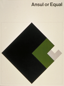
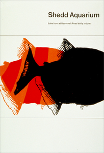
John Massey designed Chicago Has a Great Lake as an in-kind gift to the city of Chicago during his tenure as the director of design at CCA and at the Center for Advanced Research in Design (CARD).3 CARD came from John Massey’s freelance company, originally John Massey Design Office, which he convinced CCA to purchase as an independent subsidiary when he was promoted to director of design in 1964. CCA gained Massey’s client base, and CARD took on projects for companies outside the packaging industry, the latter CCA’s specialty. A portion of the profits from those projects was used for design research and civic programs like the Chicago Cultural Communication Project. Massey came up with the poster campaign during a trip to Switzerland where he was inspired by the variety of posters and banners in public spaces.4 Seeking to celebrate Chicago landmarks and features, Massey and several designers like John Rieben, Carol Lipper, and Tomoko Miho from CCA and CARD designed sixteen posters that celebrated the city’s parks, architecture, and such cultural institutions as the Shedd Aquarium, the Adler Planetarium, and the Museum of Science and Industry. Each artist interpreted their concept differently, producing a variety of posters that ranged from abstract designs to photomontage to playful font. Though diverse, each poster was consistent in its use of minimal text, considered space, and overall clean composition.

Building on his father’s lumber business, Walter Paepcke founded CCA in 1926 as a manufacturer of paperboard packaging. Paepcke was a noted businessman, and, with the encouragement of his wife, Elizabeth, he was also an enthusiastic patron of the arts. He supported the Hungarian artist Laszlo Moholy-Nagy and his efforts to set up a new Bauhaus in Chicago in the late 1930s. The school later developed into the Illinois Institute of Technology’s Institute of Design. His wife also encouraged him to hire an art director, which he did when he hired Jacobson ten years after founding CCA. Jacobson designed one of the first full corporate identity programs that included a new logo, stationery, invoices, advertising, and a redesign of trucks, factories, and offices.6
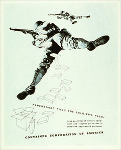
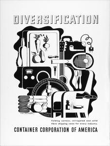
Paepcke also tasked Jacobson with remaking the company’s advertising program. Recognizing that his paperboard packages were not distinctive enough to differentiate from the competition, Paepcke sought to distinguish the company. He hoped that a sophisticated ad campaign would represent a sophisticated company making sophisticated products, even if the products were everyday paperboard packages. Paepcke and Jacobson worked with Charles Coiner, art director of the advertising agency N. W. Ayer and Son, to find the leading modern artists to design the first series of ads. Coiner went directly to European artists, whose work tended to be more experimental than what was then prevalent in the U.S. The France-based poster artist, A. M. Cassandre, was the first artist commissioned, and he designed twelve advertisements between 1937 and 1938. Because the CCA advertising budget was small then, the advertisements had minimal text and were printed in gray scale.7 Cassandre’s “Diversification” advertisement, nonetheless, used the constraints to its advantage by keeping the Cubist composition of assorted objects uncluttered. Without ever featuring a package, for which the company was known, the advertisement’s message was nonetheless straightforward—that CCA packaging could handle the needs of the diverse objects represented; they could contain perishable produce to delicate perfume bottles to a large side chair. The inclusion among the objects of a pipe and guitar playfully nods to the still lifes of the Cubist painter, Juan Gris. A viewer knowledgeable of modern art would have recognized the advertisement’s subtle wit. The first ads set the standard for the series to come: minimal support text to emphasize art that was modern and smart.
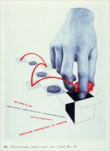
As CCA’s advertisements gained publicity, other European artists were commissioned to create work. Artists such as Toni Zepf, Herbert Bayer, Fernand Léger, Gyorgy Kepes, and Jean Carlu incorporated photomontage and impactful typography.8 The advertising budget grew, so that during the World War II series, advertisements by internationally known artists such as Herbert Matter, Man Ray, and Matthew Leibowitz were able to use accents of color.9 The next two series, United Nations and United States, established the methods that CCA would continue to use in subsequent decades. The company commissioned a different modern artist for each ad. For the United Nations series, published between 1944 and 1946, the company commissioned artists from each of the Allied nations that fought during the war to illustrate their country. For the United States series, published between 1946 and 1949, the company commissioned artists from each of the then 48 states and four territories to illustrate their state. Both series emerged with diverse styles, from representational picturesque views to abstract interpretations of each region. The supporting marketing copy was minimal to highlight the full-color art.10
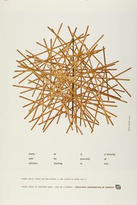
The Great Ideas of the Western Man series was the company’s most famous campaign, in which CCA’s previous approaches to advertising and Paepcke’s interest in culture came together to create a tour de force. The campaign was the company’s longest running, beginning in the early 1950s and spanning three decades.11 The idea came from a Great Books of the Western World discussion group, in which Paepcke and his wife participated at the University of Chicago. Like previous CCA campaigns, a different modern artist was commissioned to design each ad, but whereas the United Nations and the United States series tasked the artist with representing a specific location, Great Ideas provided artists with a quotation to illustrate.12 Initially, Mortimer Adler, who co-led the discussion group, selected quotes from classic texts for the advertisements. A small committee that included the Paepckes, Jacobson, Herbert Bayer, and members of Ayer and Sons, then selected modern artists to create the artwork. As in previous campaigns, artists had the freedom to interpret their assignments in whatever style they chose, and, as before, there was little support copy. At the beginning, the ads appeared every month, featuring quotations that were moral, philosophical, and political.13 The Great Ideas campaign was different from the company’s previous campaigns and from the company’s competition in that it never mentioned or referred to its products. CCA had long established its commitment to modern art and good design, but by focusing on great ideas, CCA presented itself as a company not solely concerned with profit, but unquantifiable pursuits like knowledge and culture. Some derided the move—David Ogilvy of the New York advertising agency Ogilvy & Mather International criticized the series “as an exercise in amateurish pretension.” Several decades later, however, he offered a comparison to a man on the street. He described: “even if I don’t read the advertisements, once a month for…years I have seen one of them, and I always recognize the sponsor—and admire him. It is like recognizing a man on the street at regular intervals—a man who dresses unlike other men. He looks different; he must be different.”14 Ogilvy was suggesting the success of the ad was its ability to distinguish the company from others like it.
Over the years, Great Ideas presented a variety of quotations and a diversity of artistic styles. Artists ranged from frequent contributors such as Herbert Bayer and Gyorgy Kepes; graphic designers such as Jan Tschichold and Paul Rand; and modern artists such as Joseph Cornell and Jacob Lawrence. Their work accompanied quotes by Ralph Waldo Emerson, Socrates, John Stuart Mill, Henry Ward Beecher, Carl Schurz, and Marcus Aurelius Antoninus, respectively. Circumstances for the campaign, however, began to change toward the late 1950s. Herbert Bayer noted that commissioning art became more challenging as modern art movements increasingly practiced nonobjective styles, which were thought to be too abstract by the CCA committee.15 Moreover, with the death of Paepcke in 1960, CCA lost its enlightened leader. The campaign continued, but at a slower pace, and it was run solely by members of the corporation without Adler and members of Ayer and Sons.16
When John Massey became the director of design at CCA, after seven years as a designer at the company, the Great Ideas campaign’s operation fell under his purview. A great reader and designer, Massey managed the process of choosing quotations and coordinating an artist from within the company to illustrate it. Sometimes he contributed some of his own art. Bayer noted that the Great Ideas ads became more graphic, relying on typography and layout, which focused more attention on the quotation, rather than on the accompanying art.17 The approach was different, but still appealing, as seen in one of John Massey’s most famous pieces, an ad illustrating a quote by the French philosopher, Michel de Montaigne about living to the point (1969). Like so much of Massey’s work, the piece interprets the idea to its essence using clean lines, simple geometric shapes, and limited flat color. In the ad, a startling representation of a heart within an eye represents a human, who looks toward a literal point, represented by the intersection of a vertical and horizontal white line over a blue plane.18 The interpretation is literal, but clear, and the overall ad is clean and pleasing.
Massey continued the Great Ideas campaign for another two decades after Paepcke’s death. He also applied a similar methodology to the Chicago Cultural Communication Project, in which a different artist interpreted a different concept. That series also recalled the Great Ideas campaign in its use of graphic design to promote an unquantifiable pursuit rather than a product—in this case, civic engagement. Just as the company’s commitment to design and culture waned, Massey found a means to extend those values in his own style.19 Indeed, the design historian, Philip Meggs declared, “While the first two decades of the CCA design legacy belong to Walter Paepcke and the corporate culture of excellence he created, the last two decades bear the imprint of John Massey.”20 Nonetheless, the company began to change when CCA merged with Montgomery Ward in 1968 to form Marcor. When Mobil took over Marcor in 1976, the executives quickly closed CARD and made Massey redundant in 1983.21 CCA was soon forgotten, its distinctive ads remembered only by the design community. The reprint of the Chicago Cultural Communication Project, however, offered a glimpse into Chicago’s past as a center for corporate design.
1 For more on the Chicago Cultural Communication Project reprints, see Renee Prickney, “NU grad revives classic Chicago tourism posters,” Chicago Tribune (July 2012), http://www.chicagotribune.com/redeye-iconic-posters-highlight-the-culture-wonders-of-chicago-20120731-story.html.
2 Victor Margolin, “Graphic Design in Chicago,” in Chicago Architecture and Design: 1923–1993, ed. John Zukowsky (Chicago: The Art Institute of Chicago, 2000), 283.
3 Dates for Chicago Has a Great Lake vary, and the date listed here is from the Museum of Modern Art in New York City’s collection. See: https://www.moma.org/collection/works/8791.
4 Maren Nelson, John Massey Vision, ed. Carissa Kowalski Dougherty (Chicago: JMI Publications, 2014), 19–21.
5 Margolin, John Massey Vision, 8, and Nelson, 22.
6 Philip B. Meggs, “The Rise and Fall of Design at a Great Corporation,” in Graphic Design History, ed. Steven Heller and Georgette Balance (New York: Allworth Press, 2001), 284, and Margolin, “Graphic Design in Chicago,” 292.
7 Martina Roudabush Norelli, “Early Series,” in Art, Design, and the Modern Corporation, ed. Neil Harris and Martina Roudabush Norelli (Washington, D.C.: Smithsonian Institution Press, 1985), 33
8 Ibid., 33–34.
9 Neil Harris, “Designs on Demand: Art and the Modern Corporation,” in Art, Design, and the Modern Corporation, 19, and The First Fifty Years 1926–1976, ed. Susan Black (Chicago: Container Corporation of America, 1976), 30
10 Publication dates for the United Nations series and the United States series vary, and those stated here are from Norelli, 48–72.
11 Publication dates vary for the Great Ideas series. In Great Ideas, ed. John Massey (Chicago: Container Corporation of America, 1976), Mortimer Adler states the campaign started in 1950, xii. John Massey indicates the campaign lasted over 25 years, xiii, while David Ogilvy says he saw the ads for almost 40 years, x.
12 Meggs, 286.
13 Herbert Bayer, Great Ideas, xi.
14 David Ogilvy, Great Ideas, x.
15 Bayer.
16 Norelli, 72.
17 Bayer.
18 See Margolin’s description in John Massey Vision, 5.
19 Nelson, 19.
20 Meggs, 288.
21 Nelson, 23.
Bibliography
Black, Susan, ed. The First Fifty Years 1926–1976. Chicago: Container Corporation of America, 1976.
Harris, Neil, and Martina Roudabush Norelli. Art, Design, and the Modern Corporation. Washington, D.C.: Smithsonian Institution Press, 1985.
Kowalski Dougherty, Carissa, ed. John Massey Vision. Chicago: JMI Publications, 2014.
Margolin, Victor. “Graphic Design in Chicago.” In Chicago Architecture and Design: 1923–1993, edited by John Zukowsky, 283–301. Chicago: The Art Institute of Chicago, 2000.
Massey, John, ed. Great Ideas. Chicago: Container Corporation of America, 1976.
Meggs, Philip B. “John Massey.” AIGA. Accessed January 15, 2018. https://www.aiga.org/medalist-johnmassey/
———. “The Rise and Fall of Design at a Great Corporation.” In Graphic Design History, edited by Steven Heller and Georgette Ballance, 283–292. New York: Allworth Press, 2001.
Moser, Whet. “Walter Paepcke, Founder of the Aspen Institute and Chicago Patron of Mid-Century Modernism,” Chicago Magazine, June 27, 2012, http://www.chicagomag.com/Chicago-Magazine/The-312/June-2012/Walter-Paepcke-Founder-of-the-Aspen-Institute-and-Chicago-Patron-of-Mid-Century-Modernism/.
Museum of Modern Art in New York City. “John Massey: Chicago Has a Great Lake.” Collection. Accessed February 4, 2018. https://www.moma.org/collection/works/8791.
Pinckney, Renee. “NU grad revives classic Chicago tourism posters,” Chicago Tribune, July 31, 2012, http://www.chicagotribune.com/redeye-iconic-posters-highlight-the-culture-wonders-of-chicago-20120731-story.html